Northern have snuck out a new map! I only chanced across it - there hasn't been any fanfare that I'm aware of. I came upon it on the website when I was looking at the map I downloaded in April. This hot mess had grabbed my eye:
I'd not spotted WARRINGTON West in my previous look at the new map. This is a proposed station between Sankey for Penketh and Warrington Central - not that you'd know it from the April map, because they forgot to include the dot on the line. That was probably why I missed it last time. This mistake has been rectified on the new map.
A few things immediately stand out. Firstly, the new map isn't scalable. When you zoom in on it - on the website or as a download - it goes fuzzy. The second is that the dot for Warrington West destroys the spacing of the stations on the line. It's also unclear which dot Warrington West is - there are three potential candidates (possibly four, if you count Widnes as well). Presumably this will all be sorted when the station opens, which won't be until at least 2018, thanks to a funding shortfall. This is why it's been ghosted out. (They've also dropped the caps for Warrington, thankfully, because this station is not in the centre of town).
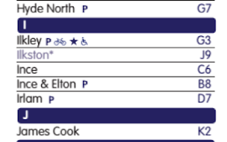
There are other ghost stations too. On the earlier map, forthcoming stations were simply stuck on the map as though they were open. Obviously this created huge disappointment, so the stations are now spectres. In addition to Warrington West, there's Ilkeston:
Low Moor:
And Kirkstall Fo - wait, what?
Yes, despite Kirkstall Forge opening in June - even getting a visit from me in August - the new Northern route map (dated September 2016) shows it as under construction.
(Also, that promise on the map key of "see below for expected opening date"? Not true. There's no opening dates on the key, as you can see from this screen grab of Ilkeston. Where it's also spelled wrong).
On the positive side, a key! And a grid! They've also corrected the font for Staveley and Burneside, so they're the same as all the others on the map:
At least I think they have. The fuzziness of the scaling makes it hard to tell. Burneside looks right, but there's something a bit off about Staveley - it's too big next to Windermere.
No sign of the sea though. I'd confidently predicted it would be back but it looks like they're standing firm on that one. I miss it. It gave a proper sense of place to the map, a real This is the NORTH. Without that simple geographical signpost, the map drifts. The logo's gone too, that big proud northern in the top right hand corner. This could be anywhere.


1 comment:
The new map sure looks really detailed. The previous one was amazing too but it was missing some locations. Even a friend of mine noticed the change in the new map.
Post a Comment